AI generated artists

AI art

I asked Claude to generate hypothetical artists, and then had gpt4o generate images based on them.

A Synthesis of Essence


Allegra di Firenze

Evelyn Zhao

Jasper Hawkins

“Unkempt Iris” listing @ CCFA

I gave it no guidance. Its choices are its own.
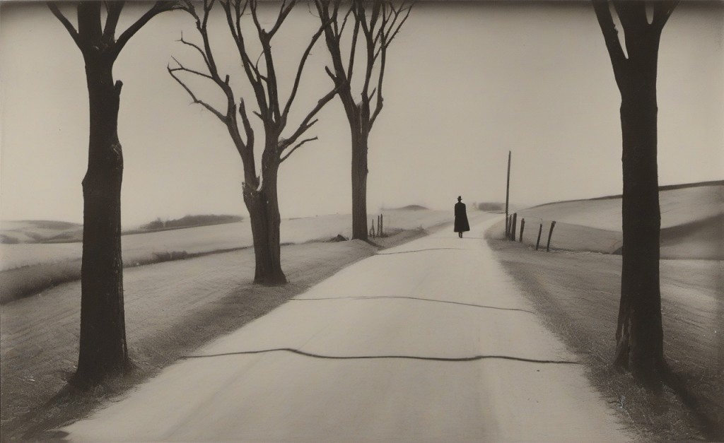
To me, these pages illustrate nicely the strengths and weaknesses of AI right now: The language is free from any obvious errors I would notice. The fabricated facts have some consistency to them.

And yet, it is all uninspired. One cliché follows the next. It is a dense condensation of all our prejudices and current assumptions. Utterly dull and uninspired. AI-generated.

This distinction between generating and creating is crucial. GenAI can generate content by synthesizing existing information and patterns. However, it often lacks the spark of true creativity. Generated things are rarely genuinely new; they are recombinations of what already exists. Creation, on the other hand, involves originality and innovation—elements that are currently more characteristic of human endeavor.
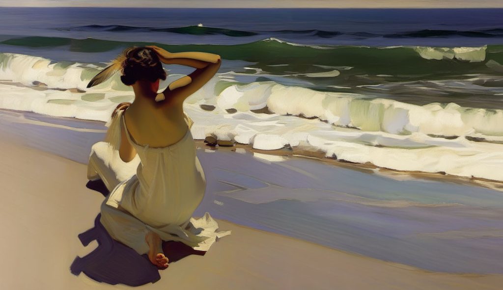
It remains open if quantitative progress, which can surely be expected from AI —after all, we keep pouring yottaflops, gigadollars, and terrawatts into the thing— will lead to a qualitative leap eventually. Then AI could actually be creative. We will see. If we are lucky. Again.
once in a while

art daily life technology

I miss it that I am no longer in LA. This looks like a building worth looking at for instance.

Iowa is not around the corner. I have never been. During my American decades I did not look at much of the country at all. But pre Covid it would have been much easier to have a look at IH tractors than it would be now. And it seems that they dissolve the museum by the end of the year.

Other things I miss? People, of course, and In-n-out. Warm weather that does not end when August ends will be another thing. Coming to think of it: It will be a tough winter: no where to fly to escape the cold.

First world problems I guess.

Lawyer Art

art economy

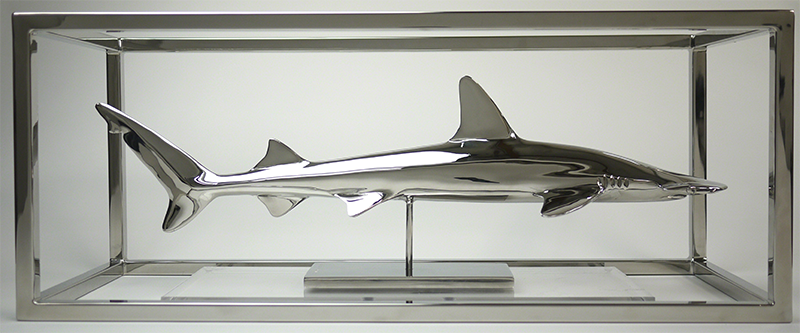
Christopher Schulz makes Sharks. Chrome Sharks. Sometimes he adjuncts the animals alongside weapons parts.

It is nice to look at. Art for men. Older men. Or other men that engage in inner monologues about their fading vigor.

Good for the market is that some of these men have money. And offices where they can place these objects. They do not know that with the purchase of a piece like this they communicate their insecurities. All they see the novelty of the combination of Chrome and Shark. That must be Art. Art they can understand. So it is good. And then it is expensive. They can afford it. And they have taste. Are modern. Their Grandma would not like it. She would see a shark in chrome. They like that about the work. She likes dolphins in porcelain more than sharks in chrome. Actually they are the same.

Nice to look at. Kitsch.

crapotopian// //carpotopian

art technology

Dezeen presents an interesting look at what kind of visuals people want to see right now.

Creative? Maybe, but creepy too. While it appears superfically to be in a in a similar vein to Joseph Kosinski’s early work, to me it clearly is far less substantial or decidedly motivated. After 12 years the aesthetics of a spot for a defunct car company still is relevant. Most of what Dezeen shows on that page will only be of historic interest in 2032. If that …

Chuck Close @ 80

art history

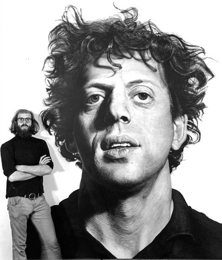
Chuck Close turns 80. Good for him. I am not a fan. There are lots of artist that bore me more, yes. His painterly pixelations are pleasing and highly repetitive. It used to be a goal for people to sit for him.

In the beginning his way of showing people was interesting. He did not really develop from there. But that is sometimes exactly what you need to be successful as an artist: Not to confuse the market with different things you might care about. If Chuck ever did is not clear.

Milton Glaser, Charles Webb

art history

Among the more than a million people that died last week were Milton Glaser and Charles Webb. Each of which created single works that grew into cultural icons of American culture in the late 60s. Bookending a time by the novel of a 24 year old and the logo made by a 48 year old that emerged 14 years apart, shows that structuring the past into numerical decades has its inherent problems. 60s is more like a label than a match for a digit column on the calendar.

Looking at the lives of both creators is interesting in itself. Seeing how the works ‘that they are known for’ influenced them is also also worth studying.

There is this romantic notion of the artist and the work forming a unity. One that really gets stretched once a work falls into the amplification black hole at the very center of public culture. The work explodes in its importance. Once it is in everybody’s head it creates its own references and connections. Robert Altman decided to open his more than watchable 1992 movie “The Player” opens with a pitch of a Graduate sequel.

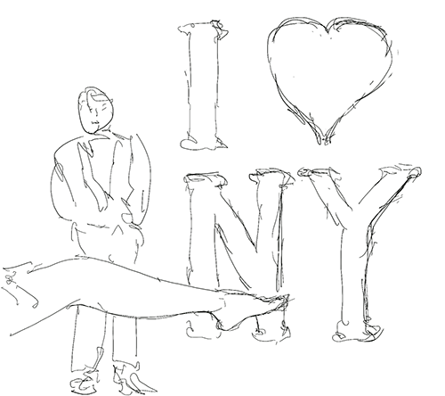
Likewise I❤NY is a staple of every T Shirt shop, not only in the five boroughs.

It is a very specific challenge for the people who made works that got this much attention. As Webb and Glaser showed it can be approached in many different ways.

Much like not just a few among the million dead had specific interpretations and memories of the movie and the emblem. All of which are gone now.

found

art

in a random sub reddit.

Nice: long exposure and light devices

twexus back online

art

Wouldn’t even know exactly why, but I brought twexus back online.

Funny how one can replace weeks of perl coding with an hour of php a decade later.

Walter Murch in Boston

art

Walter Murch is easily my second most favorite editor.

I really like how his talks focus on new aspects, and yet they are coherent. Since he is a coherent. It is always nice to listen to somebody who thinks for himself.
Not just repeats what others might have said. Even when he talks about ‘The Tell Tale Brain” – a book that I read and loved myself – he is able to give it an interesting
new perspective for me.

I sometimes wonder what the ratio of people that think as astute and independent as he does would need to be so that it would change the world.
My guess is that it actually very small. My fear is that the ratio in reality is even smaller than that.

logos

art marketing

Honest logos. Could easily be extended. Probably since companies with much to hide pay more for their branding.